Tag: web

  • BCC Innovation World

    BCC Innovation World

    The other large project we’ve been working on for the past few month is the immersive component of BCC Innovation Festival, the startup festival held by BCC ICCREA. This is a very large conglomerate of what are basically Credit Unions, when translating it into English.

    Immersive identity

    The concept developed by our clients’ communications department was centered on a low poly theme, and in particular on a low poly version of Rodin’s The Thinker. We created a 3D version of this low poly concept, and we put it in a scrollable three.js webpage, which was then embedded on the homepage of the festival for the vast majority of the festival’s duration. (It has now been replaced with a countdown to the pivotal Festival Day, which is on the 20th of September).

    We’ve also created a webAR version (using <model-viewer>), to see the Thinker in your space, which has been featured on the festival’s promotional posters.

    We also made 3D printable versions, which were supposed to be handed out to the winners, kind of like Oscar statues, and a massive version that another contractor was supposed to cut out of polystyrene foam, but they were both canceled for cost reasons. As I write this, we’re seriously considering just building a massive cardboard Thinker and bringing it to the Festival Day. It wouldn’t be profitable, but boy would it be cool.

    Immersive Experience

    Using FrameVR, we built a 3D world in which all the information about the festival, including the live event during the Festival Day, can be experienced immersively. It’s a webXR experience, so all you need is a browser, it runs on smartphones, computers, and XR headsets. It runs pretty great on both the Quest 2 and the Quest 3.

    World building

    We designed the environment to foster a sense of exploration. Due to platform limits it was pretty hard to build real interactions, so we basically ended up building a walking simulator. You can walk around, find information about the festival, and most importantly interact with other visitors. People can talk with spatial audio, share whiteboards, stream videos, share their own screens, add 3D models or images. They can personalize their avatars (including with Ready Player Me), and control them through their webcams or through their VR setups.

    The whole environment is built in a low poly style, both to match the Thinker and to optimize performance on low-end devices. Apparently there are quite a bit of those among the computers given to our clients by their corporate IT.

    Scattered around the environment are some large stones with the same material as the Thinker. Currently we don’t have it enabled to increase signal to noise ratio, but we also tried assigning sounds to each stone, that would trigger when someone walked next to them, creating an harmonic progression.

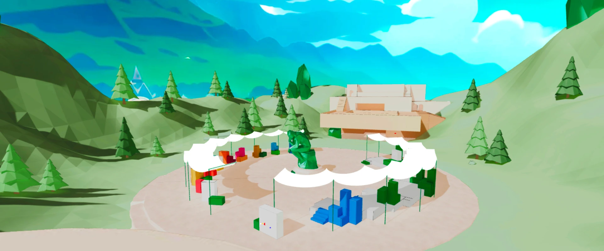
    Users start their journey in a small hexagonal corral, filled with a festival timeline and a clickable map. We worry that the clickable map undercuts the sense of wonder and exploration, but it also makes moving around much quicker. Following the path one can reach a panoramic platform, or what we called the Innovation Square, a large concrete circle sitting in a rather wide valley, where a large Thinker acts as a centerpiece.
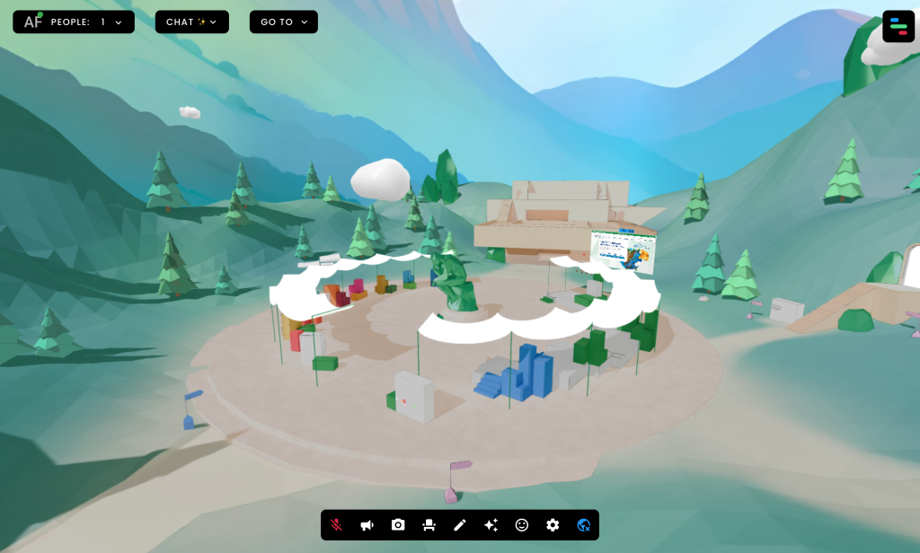
    On the left you can find information about the UN 2030 Agenda for Sustainable Development objectives that all candidate startups (Champions in the BCC lingo) have to pursue in some way.

    On the right you can find information about the festival itself, and about the institutional partners.

    At the far end you can see a large building, creatively denominated “Innovation Building”. It was originally designed as a very permeable space, allowing access from different directions, and ideally the flow of people would be visible from the outside in.

    Innovation Building
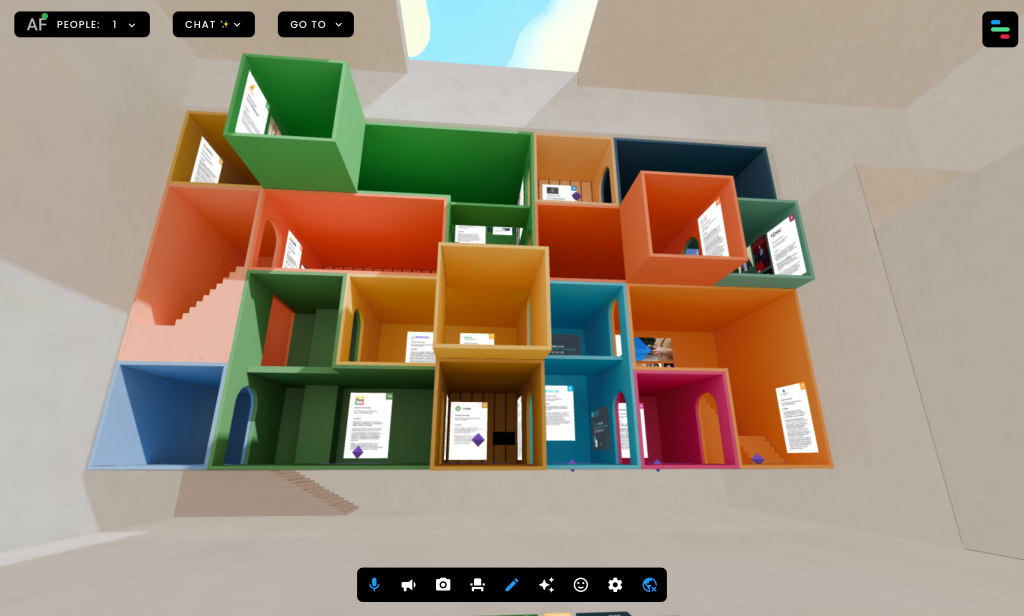
    Inside the building itself we had to showcase the startups. They were originally supposed to be 20, but they ended up being 30. They’re classified by UN objectives. This “bento” shape is replicated in two small maps, one on the floor and one on the opposite building, which allow visitors to understand the layout, and to click on them to teleport to the cube they want to visit.

    The startups were allowed to send text, images, video, and 3D models to showcase what they’re working on. Sadly, nobody ended up having any 3D material, despite the fact that several worked on domain areas where having a 3D representation would come in quite handy. Quite a few startups provided video, and the spatial audio works great at letting multiple people watch them without interfering with other visitors.

    Coming Soon

    We also built an Auditorium used for startup-only seminars, and we’ll soon have more to share about the Festival Day, and about the performance of the FrameVR platform.

  • Tip: use Tree to generate HTML directory listings

    Part of our job in the BCC Arte & Cultura project is to provide the “high fidelity” visualizations for each artwork. For some that means one of our 3D scans, for others it’s simply a zoomable interface. Our clients are making a “standard” website and simply linking to our server for the high fidelity version. We are not done processing all the artworks, but we can provide the URL in advance, they are all ordered by a bank/author-title schema. I wrote a script for creating the folder structure, but then I wanted to provide a single page listing all the URLs to our clients.

    With a bit of research I found out a oneliner using the tree command.

    You can try the result on https://e-muse.it/bccaec

    “opere” is just the relative path between the location where I’m running the command and the directory structure I wanted to transverse.

    tree opere -d -H "https://e-muse.it/bccaec" > index.html
  • Expedition report: BCC Arte & Cultura

    The first half of this year was taken up by two large projects for BCC ICCREA. We’re doing the immersive components of the BCC Innovation Festival (a startup festival, we were among the winners of the first edition) and of BCC Arte & Cultura (an effort to catalogue the art and cultural heritage artifacts belonging to the banks of the group). For the latter, we went around Italy digitizing the most complex and 3D objects.

    All the points we visited

    Logistics

    At this point it’s not really clear what we’re allowed to publish, as legal departments are surprisingly slow in responding to our queries, so we are going to err on the side of caution. You’ll have to wait until the official announcement before we post the actual works that we’ve digitised, but there shouldn’t be any harm in discussing how we set up the logistics.

    Sadly, these locations were largely connected too poorly to attempt to do the whole trip using public transport. We really wanted to be ecological, but we didn’t find a way to do it in the given time and cost constraints without heavily relying on cars.

    Once we could confirm the availability of the works on a given day we found cheap accommodations on Booking, loaded all the equipment and all the team members in a car, and we generally tried to avoid traveling during working hours. Northern Italy was covered through a series of short trips, while central and southern Italy were covered sequentially, going roughly clockwise. Some extra trips had to be broken out of the main loop, we managed to make that convenient by relying on some really good friends, who very graciously hosted us.

    The whole thing cost us a bit under €2000, which is not too shabby for a 3-person team. This figure includes highways, fuel, accommodation and food, but it does not include the wear and tear on my car. Or the fact that I forgot some lenses at a friend’s place.

    What we digitized

    Again, we’re not supposed to share images of the works, as many of them are copyright encumbered, so stay tuned for the official launch of the project. I don’t think there’s any arm in sharing a list of what we did, though:

    • Alla fine del Giorno, Alberto Sughi, oil on canvas
    • Natività, Ilario Fioravanti, painted ceramics
    • Presepe, Capuano Brothers, multiple materials
    • Ducal Palace and several artifacts, in Mafalda
    • Ut Unum Sint, Arnaldo Pomodoro, outdoor metal stele
    • Bank building, Ugo Pagliara, building and architectural drawing
    • Carrù Castle, building
    • Chandelier made of Murano glass, 3 paintings, near Venice
    • Acquaviva Picena, whole building (we ended up scanning the whole town)
    • Incontri al Maneggio, Silvano Spessot, iron and colored glass sculpture
    • Untitled, Nane Zavagno, steel sculpture
    • Pinocchio, Venturino Venturini, bronze sculpture
    • Sant’Antonio Abate, Luca della Robbia, painted ceramics
    • Bank builiding, part of the Gradara castle-town
    • Bank building in Alba (no drones for this one, we had to climb literal towers!)
    • Assalto all’Olimpo, Bruno Liberatore, bronze sculpture (a much larger version is in Rome)
    • Untitled, Cesare Berlingeri, bent and stacked colored paper
    • An archeological site in Rome, featuring Imperial-age fresco-ed walls and a very well preserved Roman road

  • Link post: Digital Dark Age

    Just sharing this MIT Technology Review article on digital archives, a cause that’s close to our hearts: https://www.technologyreview.com/2024/08/19/1096284/data-archives-archeologists-tiktok-future-wayback-machine/?src=longreads

    It is always a good occasion to mention: donate to the Internet Archive, it is such an important resource, and it’s constantly under attack. Donating to them was the first thing I did when I got my first wage (rapidly followed by Wikipedia).

  • Self description considered harmful

    In the post on alt-text from the other day we briefly talked about our perplexity about self descriptions: the trendy practice of describing one’s appearance when speaking at online conferences.

    The new WebAIM screen reader user survey came out, and it turns out that 68% or respondents agree with us.

  • TIL: minimal PWA setup

    TIL: minimal PWA setup

    Our webdev approach tends towards the minimal, we’re allergic to leaky abstractions. Even using WordPress for this blog is mostly motivated by learning more about such a popular system, for everything else we use good old HTML + CSS + JS, served by a good old Apache web server.

    PWAs (Progressive Web Apps) are websites which can be installed on a user’s device, and that can even be listed in app stores. Our research indicates that a certain percentage of users search their app stores before searching on the web. This is honestly hard to comprehend, but that does not mean that we don’t want to serve those users. Most people building PWAs use JavaScript frameworks, like React, Vue, Angular, Flutter, and just so many others.

    We’re deeply suspicious of those framework. It is certainly possible to use them well, but the examples of their misuse, and of people learning them before learning actual web development, and consequently perpetuating terrible, unaccessible, practices, are just too widespread to ignore.

    Luckily, we don’t have to get our hands dirty to get the benefits of PWAs, we just need to add a manifest and a service worker. We don’t even need to actually write them ourselves! We can just install PWABuilder Studio for Visual Studio code, open the folder for our web app, and run a couple of commands.

    Specifically, press Ctrl+Shift+P to open the command Palette, write PWA to find the relevant commands, and then run PWA Builder Studio: Generate Web Manifest. This will generate a manifest.json file, in which you’ll have to specify your app name, canonical URL, icon, and so on.

    Then run PWA Builder Studio: Generate Service Worker to enable offline functionality.

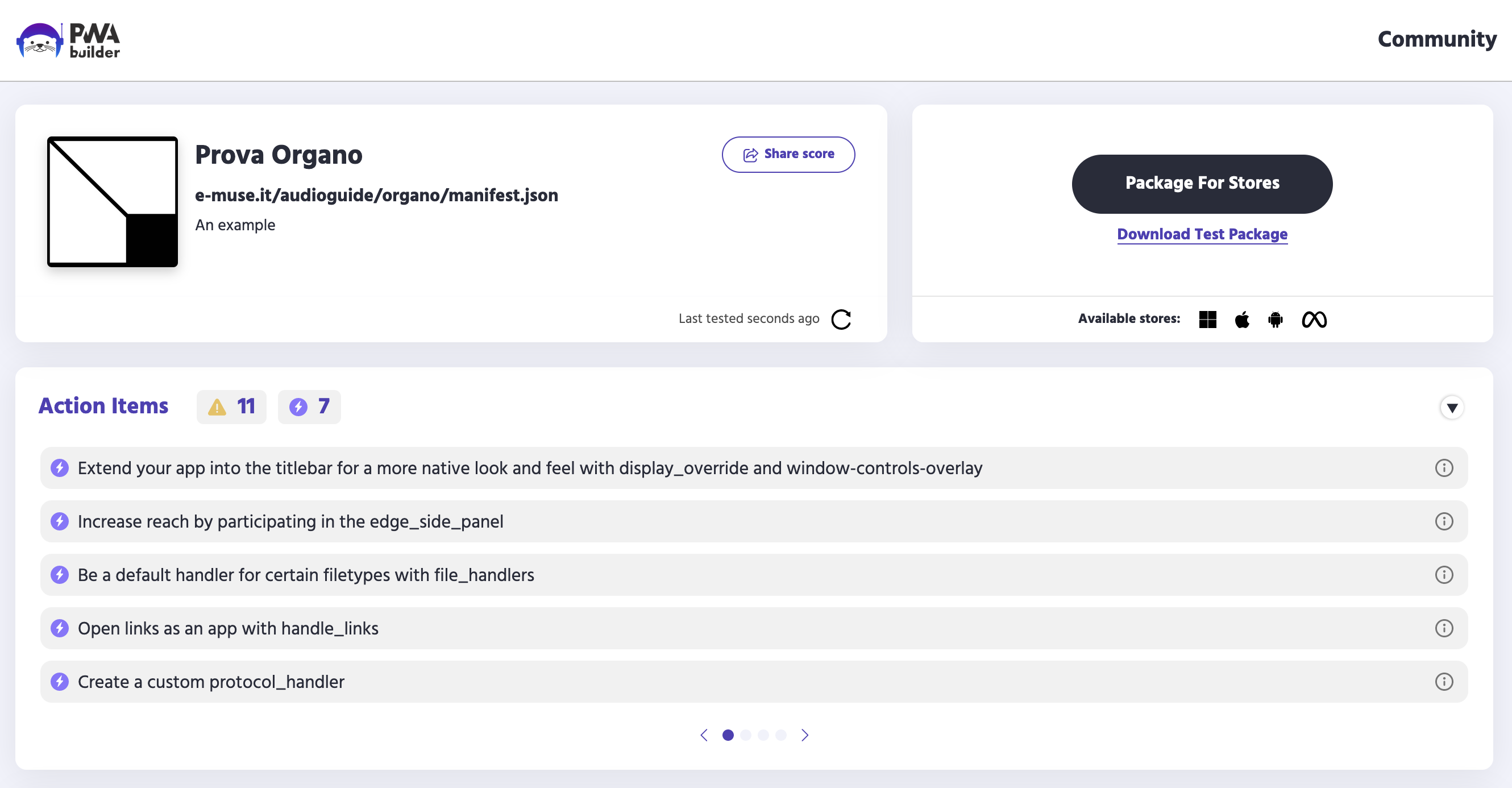
    You can test your results as soon as you’ve uploaded your files to a web server of your choice, we tried with the demo of an audio-guide product that we’re building. If you insert the URL of your web app into the PWABuilder homepage you can obtain a report card, and you can download packages that can be submitted to the main app stores (Windows, Android, iOS, Meta Quest).

    And that’s it, the only question is how to communicate the new functionality to your users. Let us know if you have suggestions on that front 😀

  • Launching BCC Innovation World

    Launching BCC Innovation World

    We started this company by winning the Bain award at the original BCC Innovation Festival, back in 2022. In a bit of a homecoming, we were tapped to provide immersive services for the next edition of the Festival.

    Il Pensatore: an immersive landing

    Following the concept from BCC’s own creative department, we created a low-poly version of Rodin’s Le Penseur. In the original concept art the statue was 3D printed, clearly showing the signs of a filament printer. Our own version was materialized with a resin printer:

    Rodin's The Thinker, in a low poly renditions, printed in black resin and displayed over a light wooden table

    This model became a sort of leitmotif of the whole immersive experience. We changed the texture to a brushed metal in the corporate green, and we provided the client with renders for web and print channels.

    We then proceeded to make this model available in webAR, using the model-viewer library. This will be used in an upcoming promotional campaign, asking the public to share pictures of the statue in their environment, a bit like we did with the whale for the Leverans comic.

    We then created the scrollable section of the festival homepage, using a threejs scene embedded in an iframe. All semantically meaningful elements were implemented as standard DOM elements, the 3D is purely decorative, but it does not detract from the accessibility of the content.

    Check it out on the Festival home page.

    Innovation World

    We also built a virtual world on framevr. The design goal was to let users interact in a shared explorable space. We’re pretty proud of the work our architect did, and there is some technically clever work on object instancing, but we’ll have here write a whole post on the matter. Keeping to the high level concept, we have a pretty linear progression from the starting point to the exhibition area, gradually disclosing information to the visitor no matter what path they choose.

    We worked pretty hard to balance visual quality with performance, and we can now confidently state that it will work on whatever device you use.

    Geodesic rocks in the same material as the Pensatore were inserted throughout, and to tie the concept together we made this short video (pretty early in the process, a lot of the environment is missing):

    Please do check out BCC Innovation World, we’ll be expanding it a lot in the next few months.

  • A few posts on alt-text

    We really care about accessibility, and alt-text is one of the most visible interventions in this field, thanks to its inclusion in social media UIs and to activist evangelism.

    As a primer, Eric Bailey wrote some thoughts about the nuances of the matter: https://ericwbailey.website/published/thoughts-on-embedding-alternative-text-metadata-into-images/

    Also check out this post by Heather Buchel, with a much broader focus: https://heather-buchel.com/blog/2024/03/letters-to-an-accessibility-advocate/

    What follows are instead our own thoughts.

    Decorative Images

    The general idea is that alt-text is going to be used by anyone who cannot look at a picture, and that it should be as good a substitute as possible. We should think about the meaning of a picture, and about its function in the webpage, and about how the alt-text will be used in practice. A whole lot of images are simply decoration, and the general advice is to exclude them, so that text to speech systems don’t waste time reading descriptions that don’t actually carry any meaning.

    However, even extraneous decoration carries connotations that influence the interpretation of the written word. Should we attempt to transmit the same connotations to every user? And should we attempt to provide cultural context for those who lack it? This is the kind of thinking that leads to people giving short self-descriptions at the beginning of online conferences, something that seems to be quite common in the US. I have nothing against it, but I also don’t really understand the value of it. I’ll happily do it when it’s asked, but I don’t do it of my own initiative.

    Rich Images

    What about images that carry a lot of information? Charts, and graphs, or increasingly maps. How do we enable everyone to access the information in our own 3D spaces?

    The short answer is that we try to follow the W3C guidelines:

    1. https://www.w3.org/WAI/tutorials/images/complex/
    2. https://www.w3.org/WAI/tutorials/images/informative/

    The longer answer is that it is a bit of an art form, and that sometimes the only solution is to be redundant, and just recreate everything in good old text. This can be hard work, but nobody claimed that having principles is easy.

    Specifically for visual art, it is sometimes very hard to motivate clients, we’ve often heard the argument that visually impaired users are intrinsically excluded, or intrinsically uninterested. We’re glad to report that our clients from the banking sector have been universally fully committed to accessibility, they’re institutionally used to it being a legal requirement. (They do tend to use overlays a bit too much, for my tastes)

    AI

    There has been much ado about the usage of AI for generating alt-text. This is something that already happens a whole lot on social networks. Famous web-usability expert Jakob Nielsen wrote about it recently (I mean, it’s a bit of a wider argument, but very related), and it caused a bit of a shitstorm in the community. I’m just going to link to Adrian Roselli’s take: https://adrianroselli.com/2024/03/jakob-has-jumped-the-shark.html

    My own take is that the work needed to make a site accessible is all going towards making the website better.

  • Press Release: Sala Venezia Giulia

    Press Release: Sala Venezia Giulia

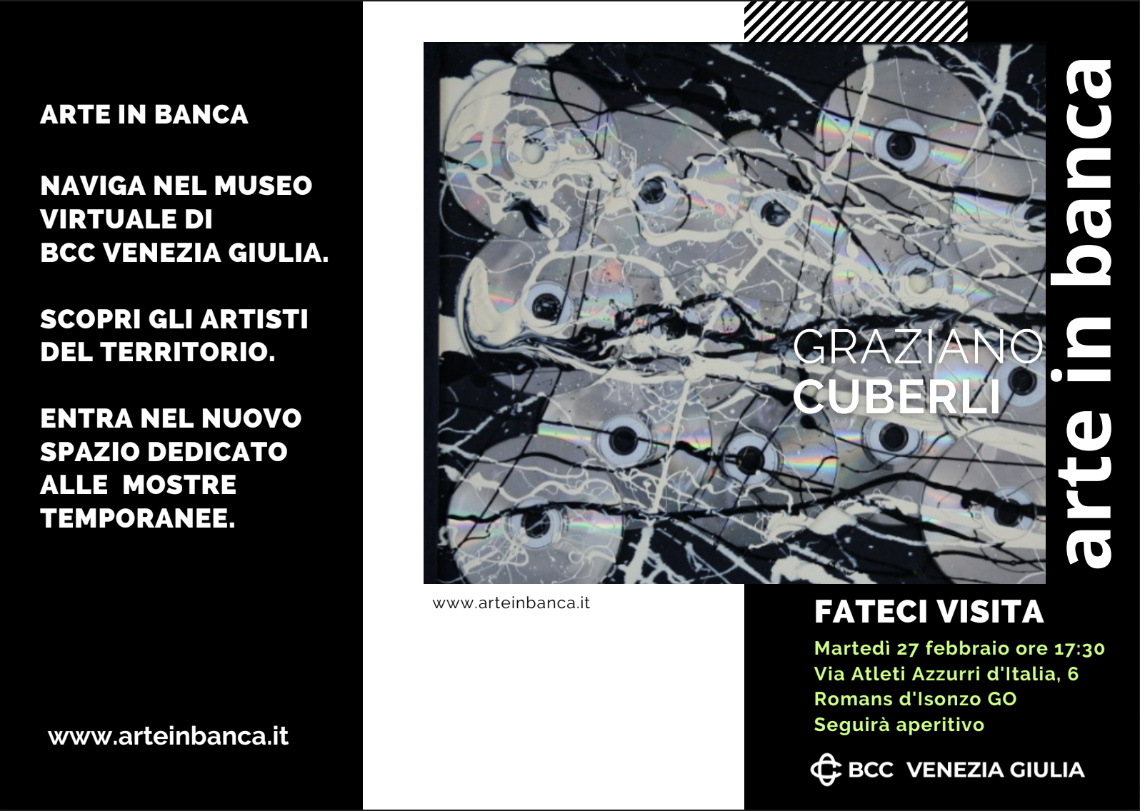
    The BCC ICCREA group issued a press release about the newly available Sala Venezia Giulia: an additional room for temporary exhibitions in the Arte in Banca virtual gallery.

    The room currently hosts 5 works by Graziano Cuberli. An inauguration reception was held in Romans d’Isonzo.

    Promotional image for the inaugural reception of the Venezia Giulia virtual room

    For the occasion we overhauled the rest of the Arte in Banca experience. A new control scheme is now available on mobile devices, and the photogrammetries in rooms 1 and 5 can also be accessed in Augmented Reality.

    Dynamic sculpture "Sunset" by Bruno Chersicla is added to a kitchen using Augmented Reality

    New mobile control scheme

    The original control scheme for the Arte in Banca project aimed at providing one-handed six-degrees-of-freedom movement on a touch device. We used a redundant control scheme for rotation, using both the gyroscope and a one finger drag gesture. This allowed for 3dof rotation, but users found the gyroscope cumbersome to use for long periods, as it imposed ergonomic constraints.

    Translation was handled with a one finger press to move forward, and a two fingers tap to move backwards. This movement was combined with the drag rotation to achieve a sort of steering, which was somewhat unwieldy in tight spaces, and didn’t allow for strafing.

    We added two joysticks using nipple.js, the left one controls translation, the right one controls rotation. This works well for people used to videogames, others don’t fare as well.

    This sent us down a rabbit hole of academic papers, user testing, and just plain old trying other products. We found that despite the popularity of 6dof games on mobile devices, most users are just terrible at achieving any sort of mobility. This is very discouraging given our goals, but we also found out that we score great in the mobile version of Call of Duty.

    It seems that there is a reason why our competitors usually restrict movement along one or more axis. This is where we stopped for the Arte in Banca project, but check this blog soon for further experimentation.

    AR view

    We also wanted to add better visualization tools for the objects and sculptures that we digitized. We went the easy way, by using https://modelviewer.dev/

    It provides a nice 3D viewer, and it allows for webAR on both Android and iOS, complete with light estimation, and some rudimentary occlusion. It can be accessed by tapping or clicking on any 3D object in the virtual museum, then on the tiny cubic icon on the right, if you’re using a supported device.

    Stay tuned, we have a lot of interesting projects to write about in the next few months!

  • TIL: a dive into web components

    Here at E-MUSE we favour sticking to HTML until we absolutely need CSS, and sticking sto CSS until we absolutely need JS, and sticking to client-side framework-less JS until we absolutely need to. Related to this, here is a tiny TIL: Offloading Javascript with Custom Properties, on the interaction between JavaScript and custom CSS properties.

    Web components allow for the richness of JS frameworks, while maintaining the clean semantics of HTML.

    Let’s start from the MDN explainer: https://developer.mozilla.org/en-US/docs/Web/API/Web_components/Using_custom_elements

    And here are a few recent blog posts and resources on web components: